Brand Identity Design Packaging Design Lisbon, Portugal / Dusseldorf, Germany 2022
WOW Coffee Roasters
Premium Specialty Coffee Rebranding
"Specialty Coffee that will blow your mind"
WOW is a young Portuguese Coffee Roaster who believes the coffee producers are the real protagonists, none of the experiences in specialty coffee would be possible without their passion and dedication. Therefore, WOW is increasingly investing in the construction of a solid and direct relationship with producers in different parts of the world to roast the best coffee and has now evolved on understanding better its target.
Before: WOW was previously designed to be young, "pop" and playful as a way of trying to speak to a general audience. The outcome was a bold design with many colors and Aztec patterns.
After: WOW's products reached a high standard of 92 points (SCA), ready for Professional Barista Competitions, by this way opening doors into Michelin Star restaurants, which started a channel to luxury targets. The rebrand also gave a huge confidence for expanding WOW operations on the European Union, opening a new headquarter in Dusseldorf, Germany.
Following the brand's evolution, WOW is on the road to achieving Zero Carbon Footprint, following a Circular Economy.
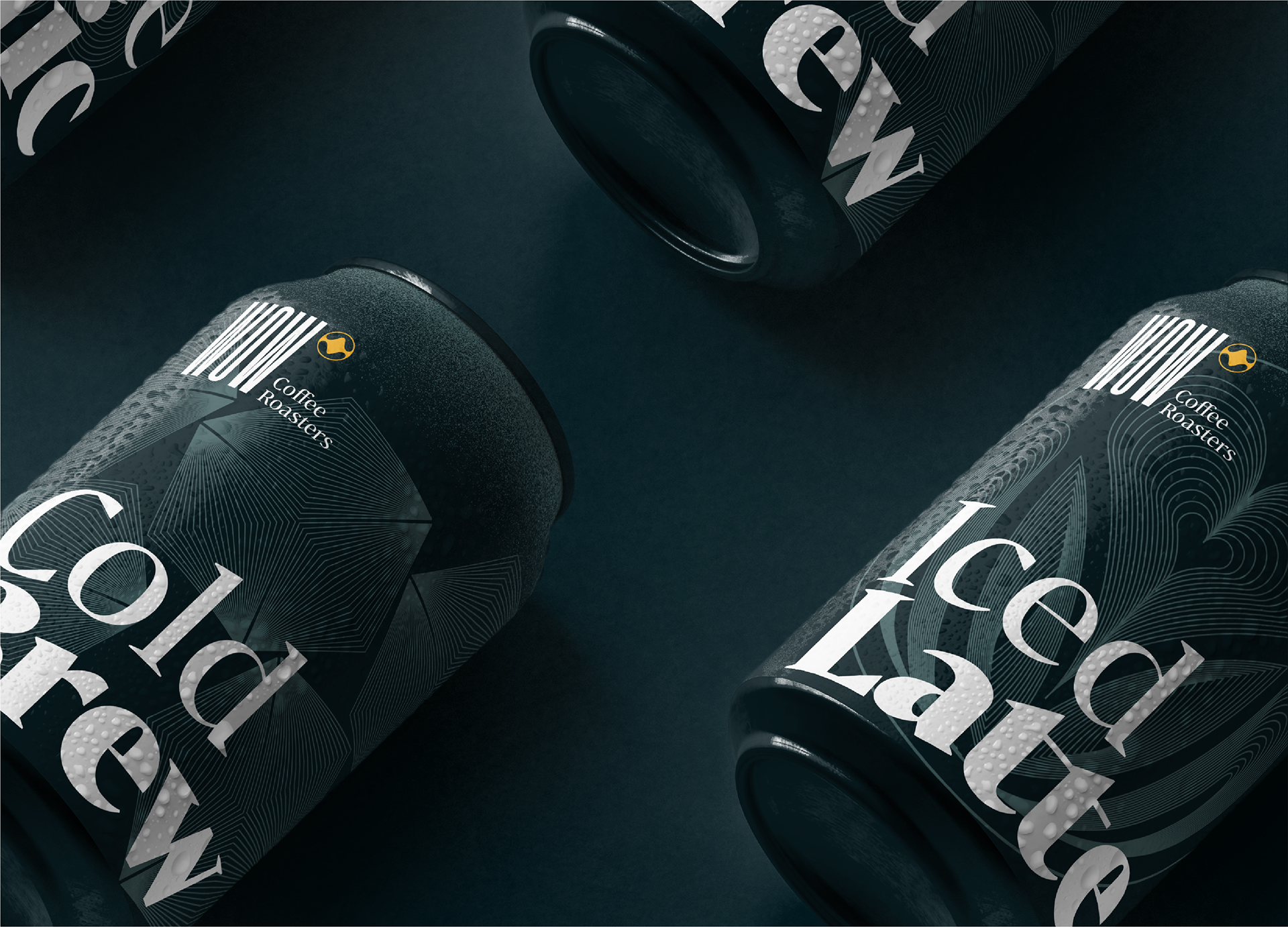

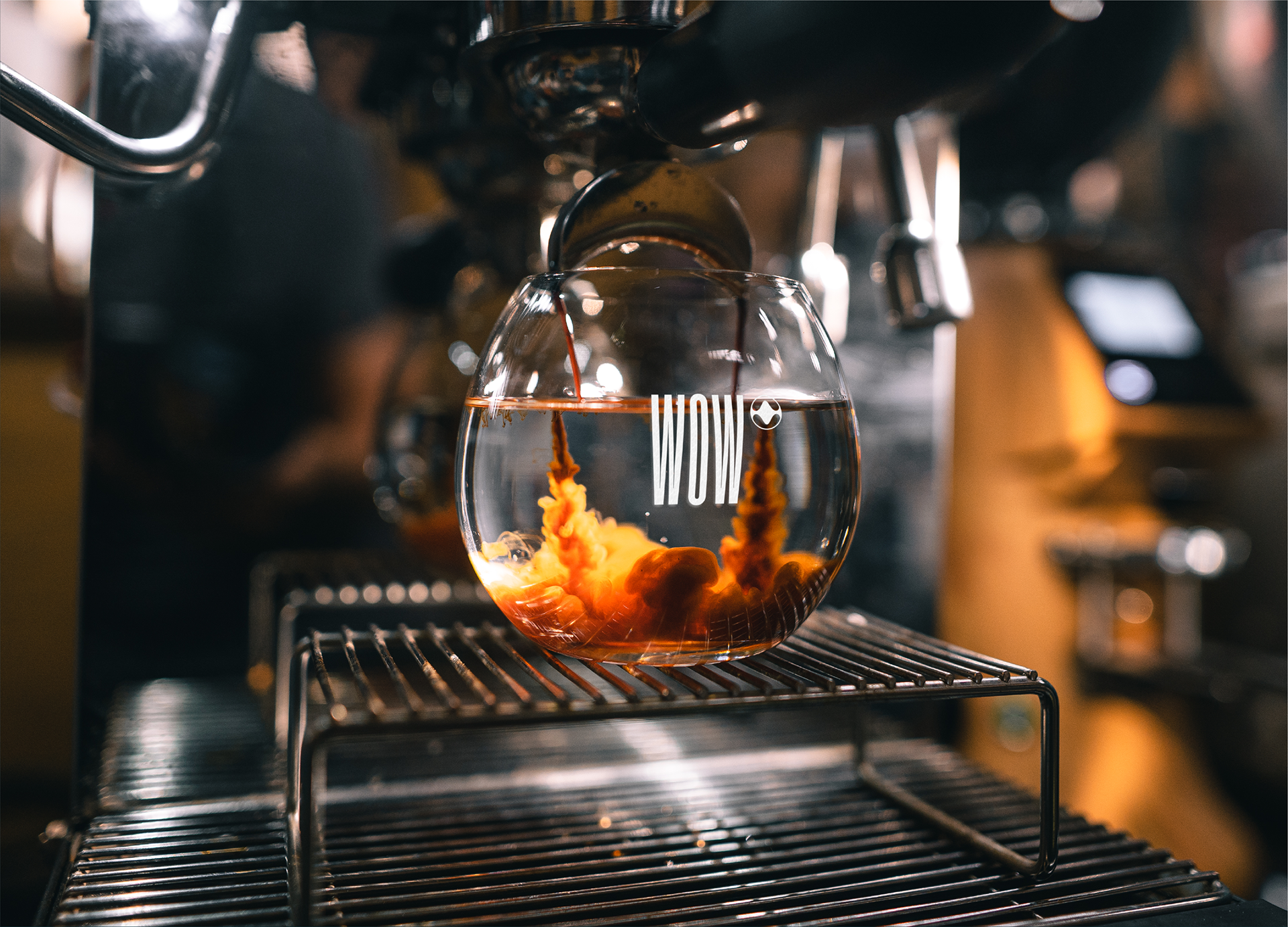
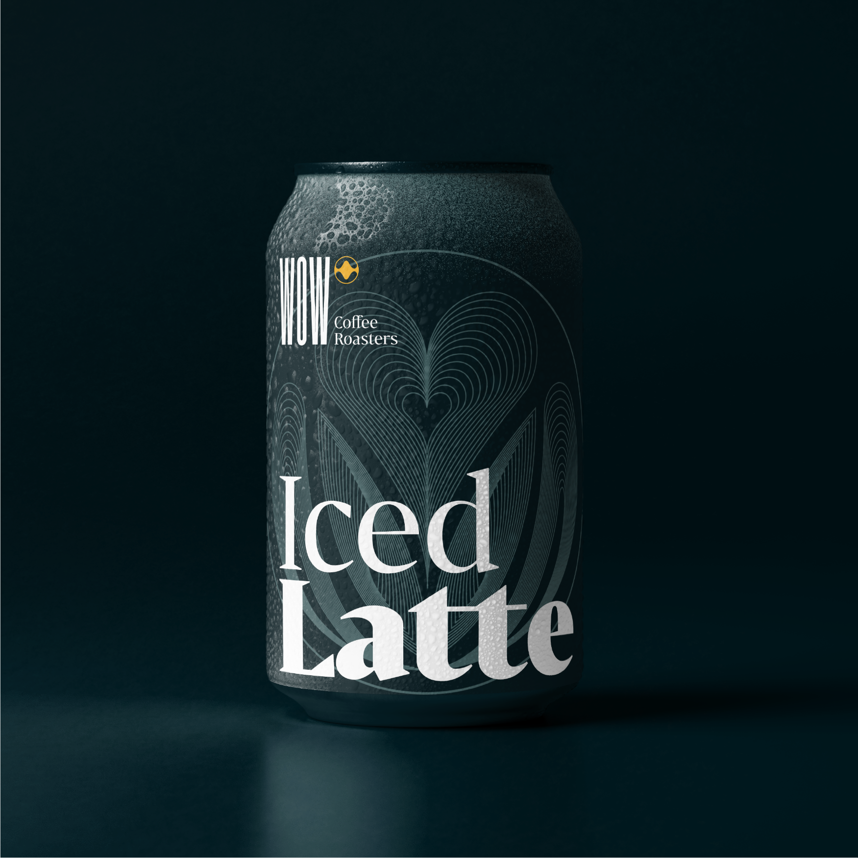
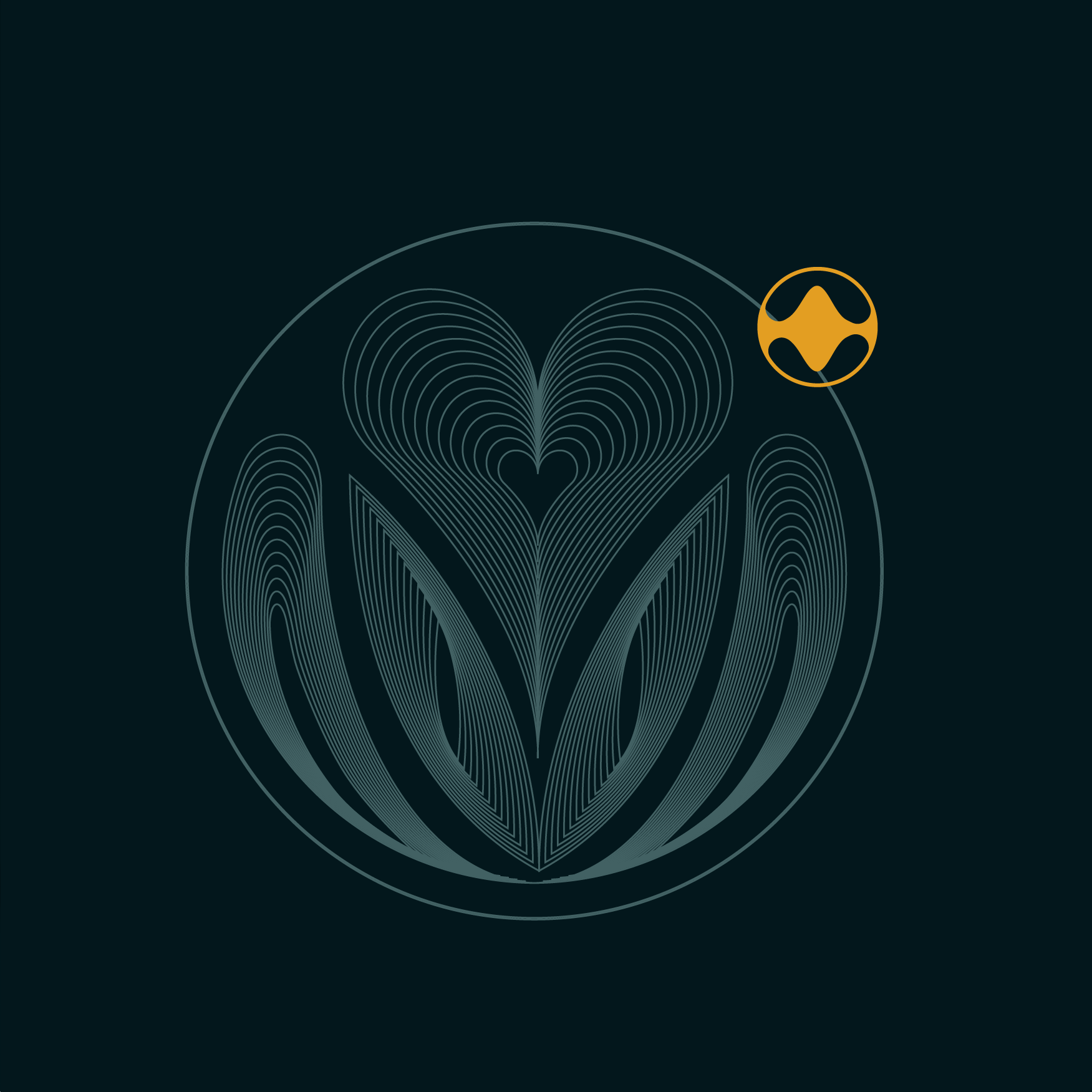
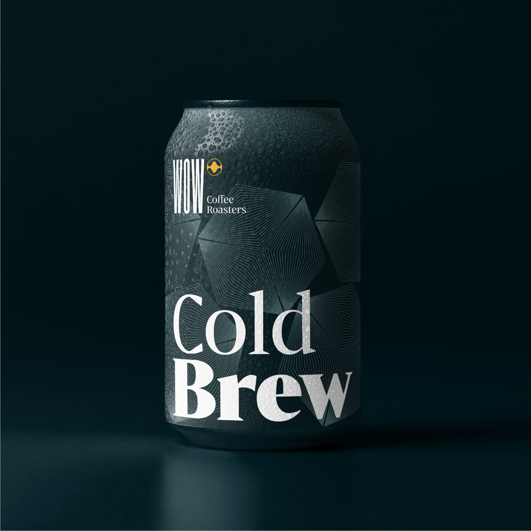
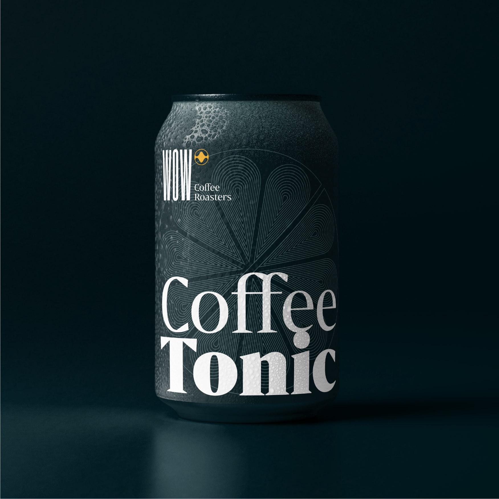
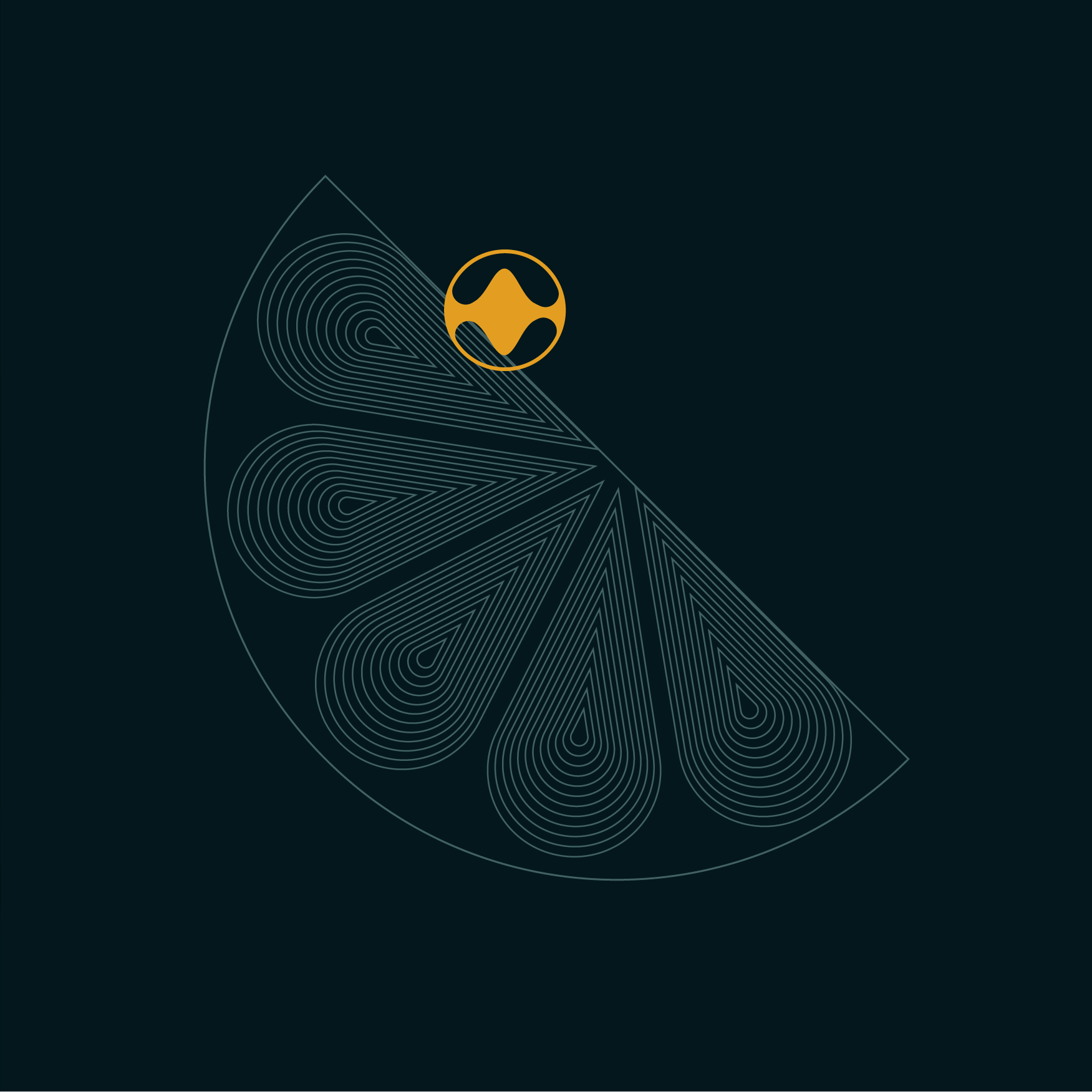
WOW's rebrand is filled with abstract and literal representations.
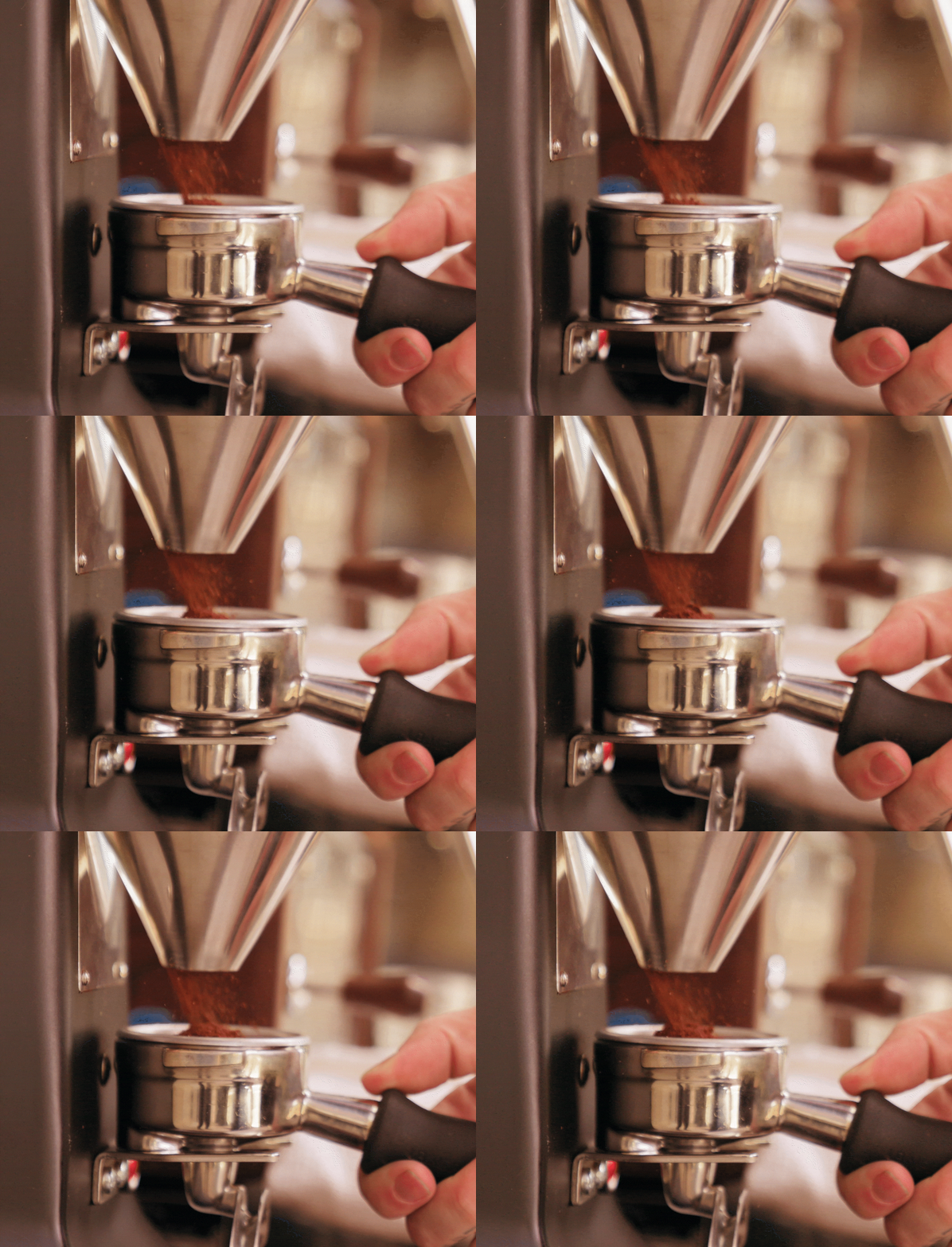
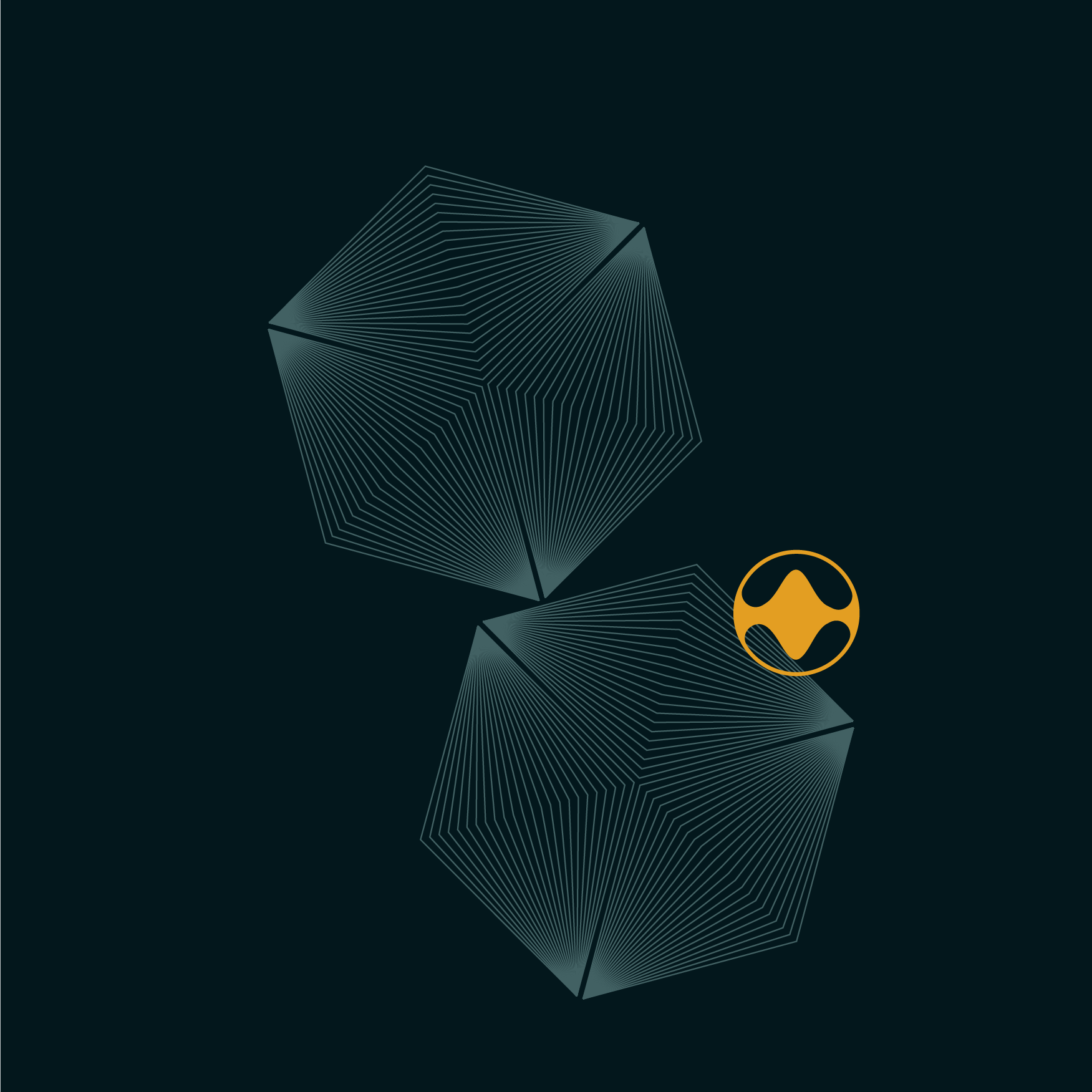
The main concept is based on the journey of taste and smell in the experience during a coffee tasting. This journey is represented as a WAVE. It comes and goes, evolving in a fluid complexity along the mouth, represented in the icon and illustrations throughout the brand. The textures used are graphic representations of ground coffee, followed by the color variations picturing the many aromatic compounds present in a coffee bean.
