MAIS Engenharia
_
Mais Engenharia is an Engineering/Architecture/Design company focused on houses for young couples.
The challenge was to structure the brand’s positioning strategy, and to project a visual identity in order to translate differentiation among the competition, thus communicating more clearly the value proposition and build brand perception to MAIS Engenharia's ideal client.
The results of the new positioning and visual identity showed up almost instantly. These were translated into a growing demand for MAIS services by its ideal customers, enabling the company to deliver a more specialized service according to the company’s objectives described in its business plan.
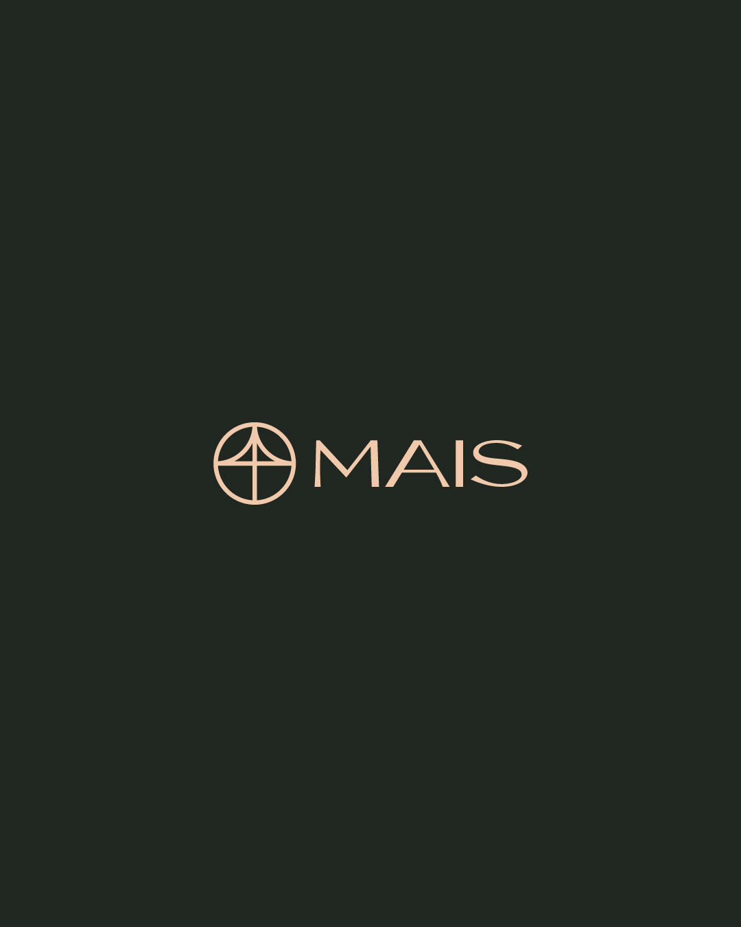
See how the logo was made:
What makes MAIS a different company from the others? Several factors, among them: It is managed by young women; Its marketing plan is 100% online and focused on content; It serves a specific niche of residences for young couples with a taste for design and tailor-made solutions. Basically, it is a young, creative and dynamic company within a market that still tends to the opposite.
Jordana Raiele and Thamara Machado are two engineers who have an entrepreneurial spirit. Faced with dissatisfaction in their respective jobs, they decided to found MAIS Engenharia, in order to deliver engineering services in a more human and empathic way.
The conceptual thinking for MAIS Engenharia started from the idea of ART as a differential. The gap between Logic and Art is where MAIS lives, a company that challenges itself every day to project with numbers and lines: Emotions to be felt, environments to be inhabited and memories to be built.
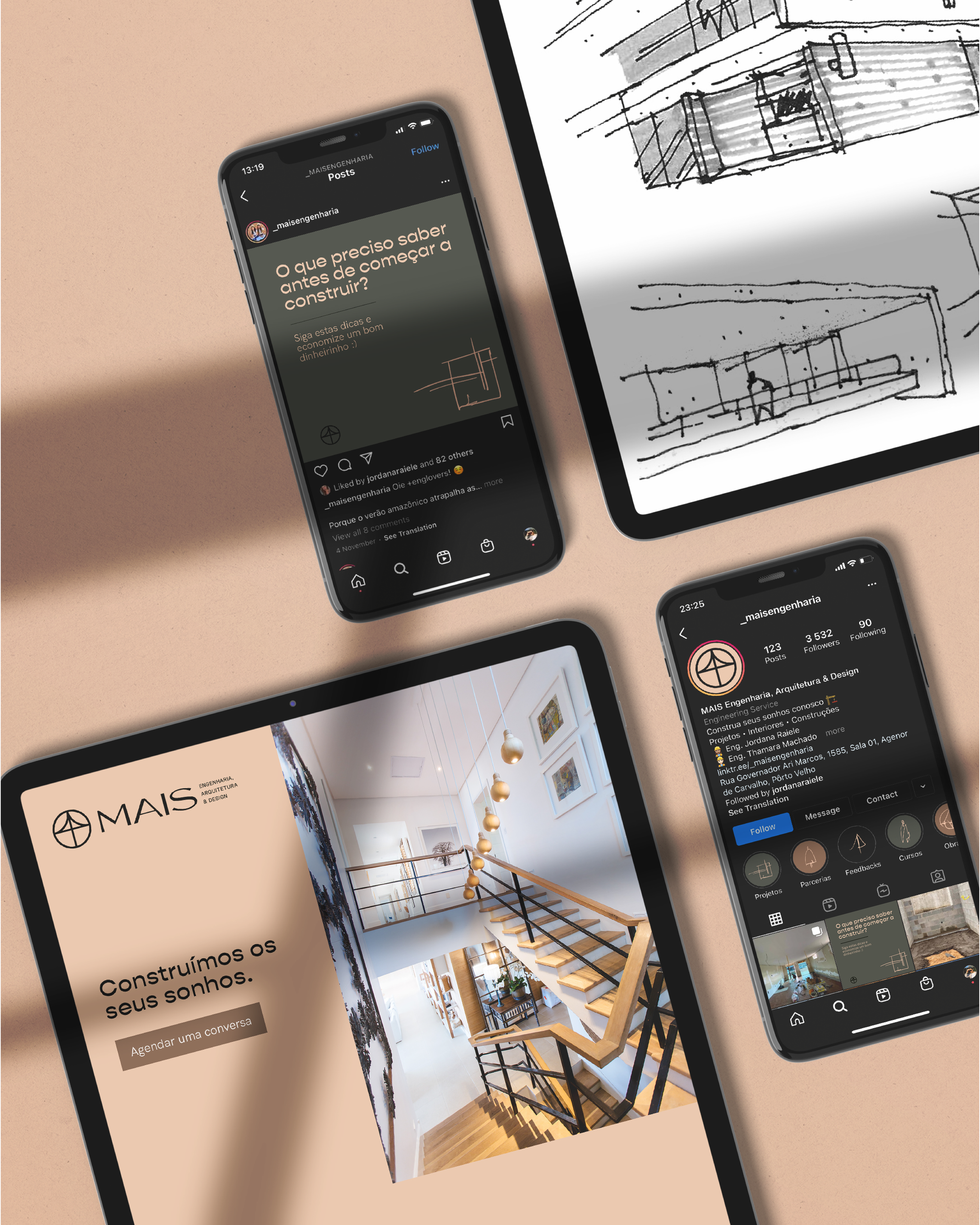
After reviewing the Vision, Mission and Values, as long as its Business Plan, we worked on the brand's tone of voice, and the solution was right before our eyes: The usage of Jordana and Thamara's first-person language to communicate on most content pieces. This would generate greater proximity and emotional affinity, something to be valued within the bureaucratic and institutionalized approach used by its competitors on their communication.
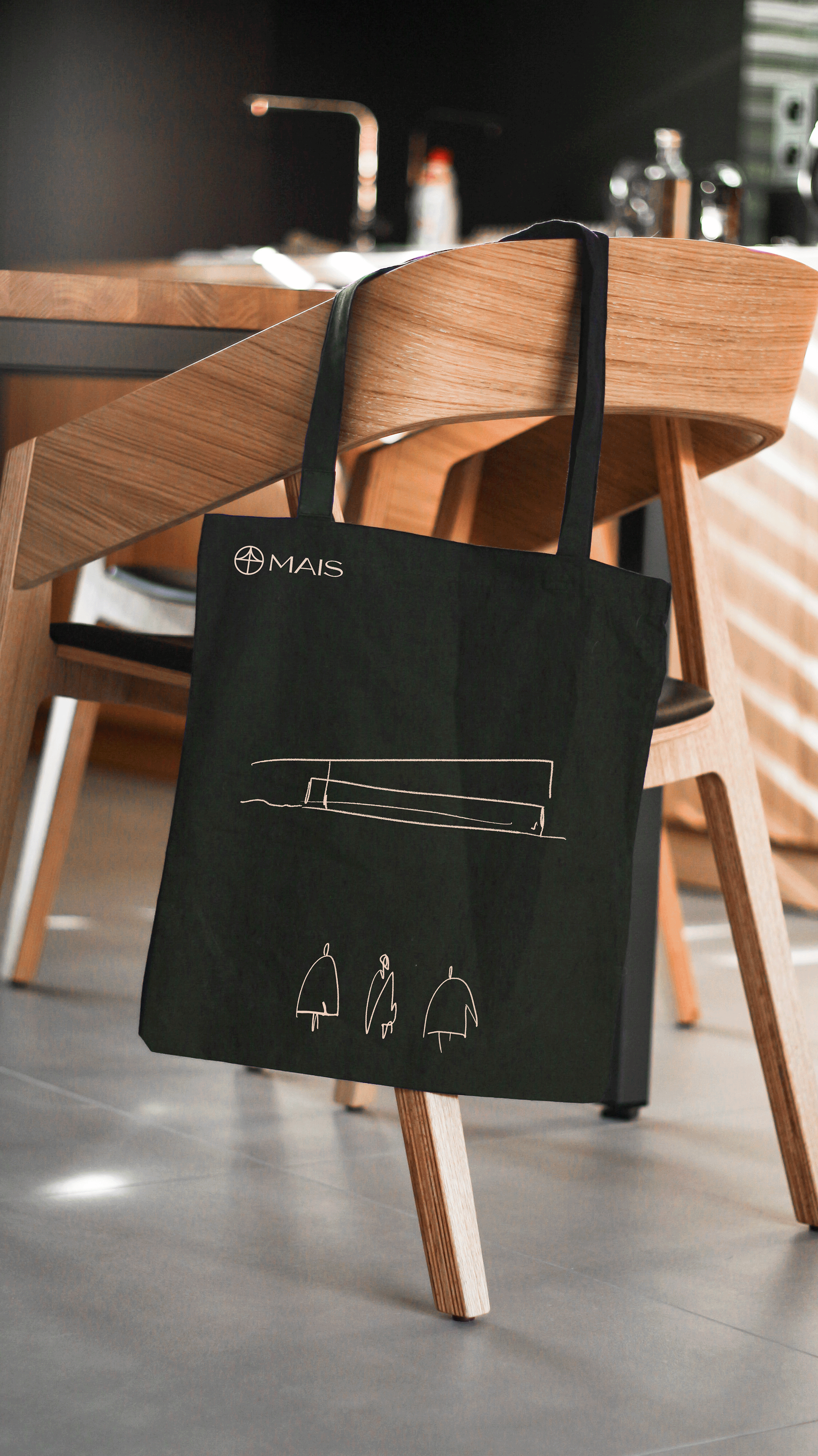
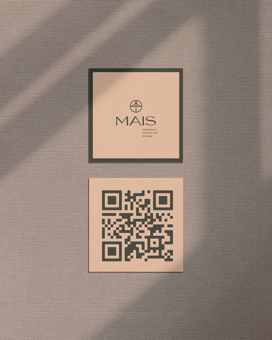
Visually, the choice of warm colors refers to wood and grass. Through research, we found that this scheme reflects feelings of welcome and warmth (cozy), which speaks very closely to residences. In addition to colors, the use of abstract lines and shapes appears to indicate freedom in dreaming, a sketch on a napkin can be the beginning of a project, and valuing this simple representation says a lot about the brand's desire to connect with their customers’ dreams, and giving life to it.
